/ 4 min read
Site Selection Tool
A map-first tool I designed and built to help health logistics teams pick drone-delivery sites, with AI-assisted filters, routing comparisons, and exports.
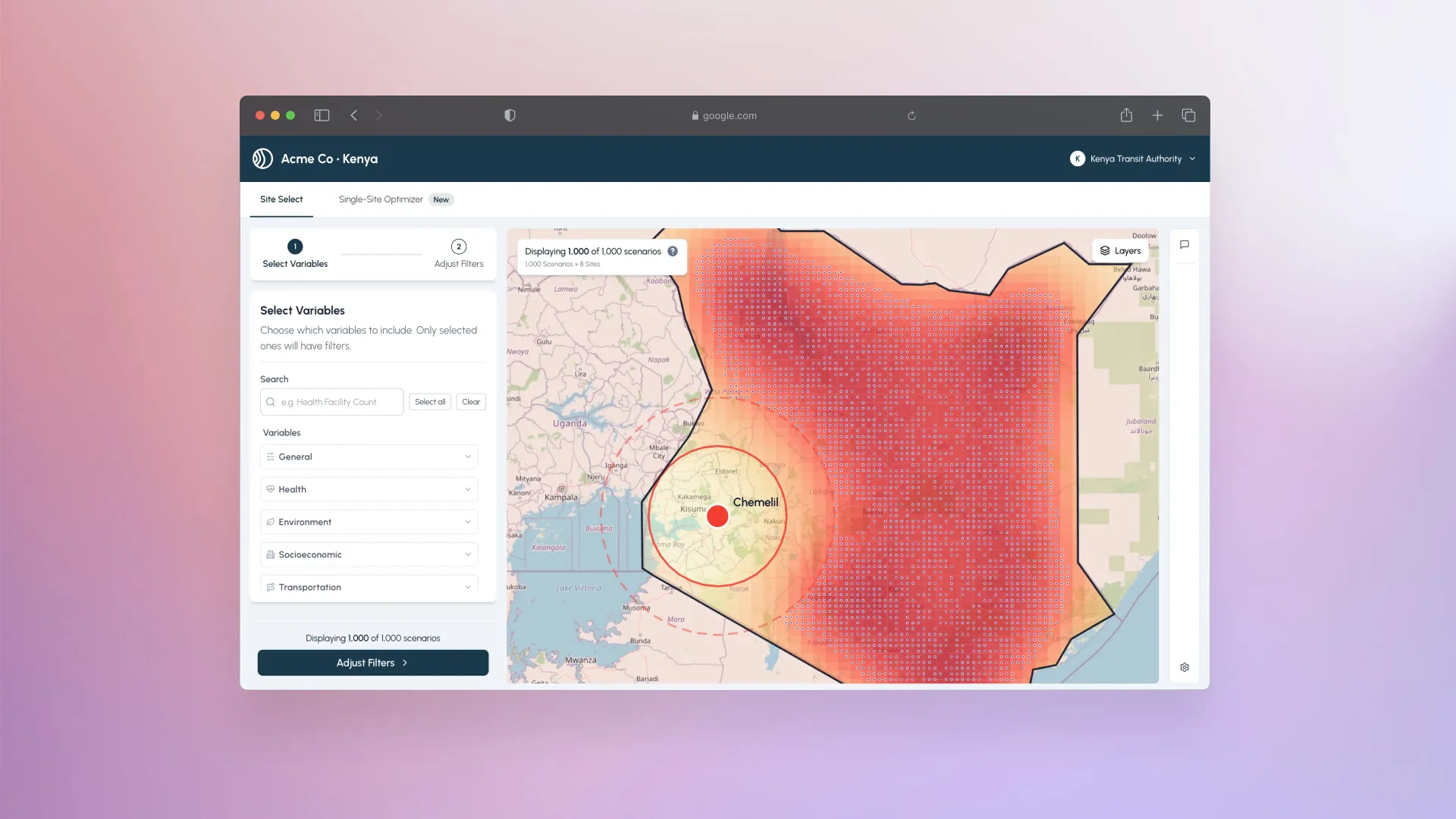
Site Selection – user experience overview
In summer 2025, I helped design and build this map-first experience to help Africa-based logistics and health teams make confident siting decisions for drone delivery of health supplies. The experience had four goals: keep people in flow as they filter, validate results on a map, compare routing options, and walk away with exports that tell the story behind each site recommendation.
My role: UX flows, interaction design, visual design, and front-end build
Goals: Clear filtering, honest spatial context, and outputs that explain why, not just which.
Problem
Stakeholders were juggling spreadsheets, PDFs, and static maps. I wanted a single place where they could:
- Start with curated scenarios tuned for a single African country (health, transport, environment, socioeconomic data included)
- Explore with both numbers and geography in view—filters and histograms on the left, map on the right
- Toggle context layers (facilities, warehouses, national medical supply depots, keep-out zones) without losing their place
- Compare drone vs. car routing to understand time, distance, and emissions trade-offs
- Export evidence in one click: PDF, high-res map JPEG, CSV/GeoJSON, plus a compact summary CSV
A quick UX walkthrough
- Land in results – You open to a country-wide view with sensible default bounds and layer toggles ready.
- Filter data – Variables are grouped by category; each histogram has “Filtered” vs “All” tabs so you can see how your choices shape the distribution. A toggle shows or hides keep-out zones (KOZ).
- Inspect on the map – Selecting a scenario highlights it spatially; base layers, keep-out polygons, warehouses, and health facilities can all be shown or hidden to check coverage and constraints.
- Compare routing options – Where routing is available, you can display drone and car routes (plus nest-to-warehouse legs) and see the trade-offs reflected in the variable panels.
- Export – One menu packages the current state into PDFs, JPEGs, CSV/GeoJSON, and a summary CSV for quick sharing.
AI-assisted filter chat
Filtering dozens of health, transport, environment, and socioeconomic variables by hand is powerful—but slow when stakeholders are still forming the question. I designed an AI Assistant Chat that lets people describe intent in plain language and watch the filter panel update in response.
The interaction is built to stay grounded in the same controls analysts already trust:
- Natural-language → structured filters – A prompt like “focus on sites near health facilities with lower keep-out risk” maps onto the existing variable groups instead of inventing a parallel UI
- Visible, reversible changes – As the assistant adjusts ranges and toggles, histograms and the map update live so people can see what changed and undo or refine by hand
- Human remains in control – Chat accelerates the first pass; analysts still inspect distributions, KOZ context, and routing before committing to a shortlist
This keeps conversational AI as a shortcut into the filter model—not a black box that replaces it.
Screens in sequence
This order mirrors the journey: shortlist, inspect, validate, then capture the winning scenario.
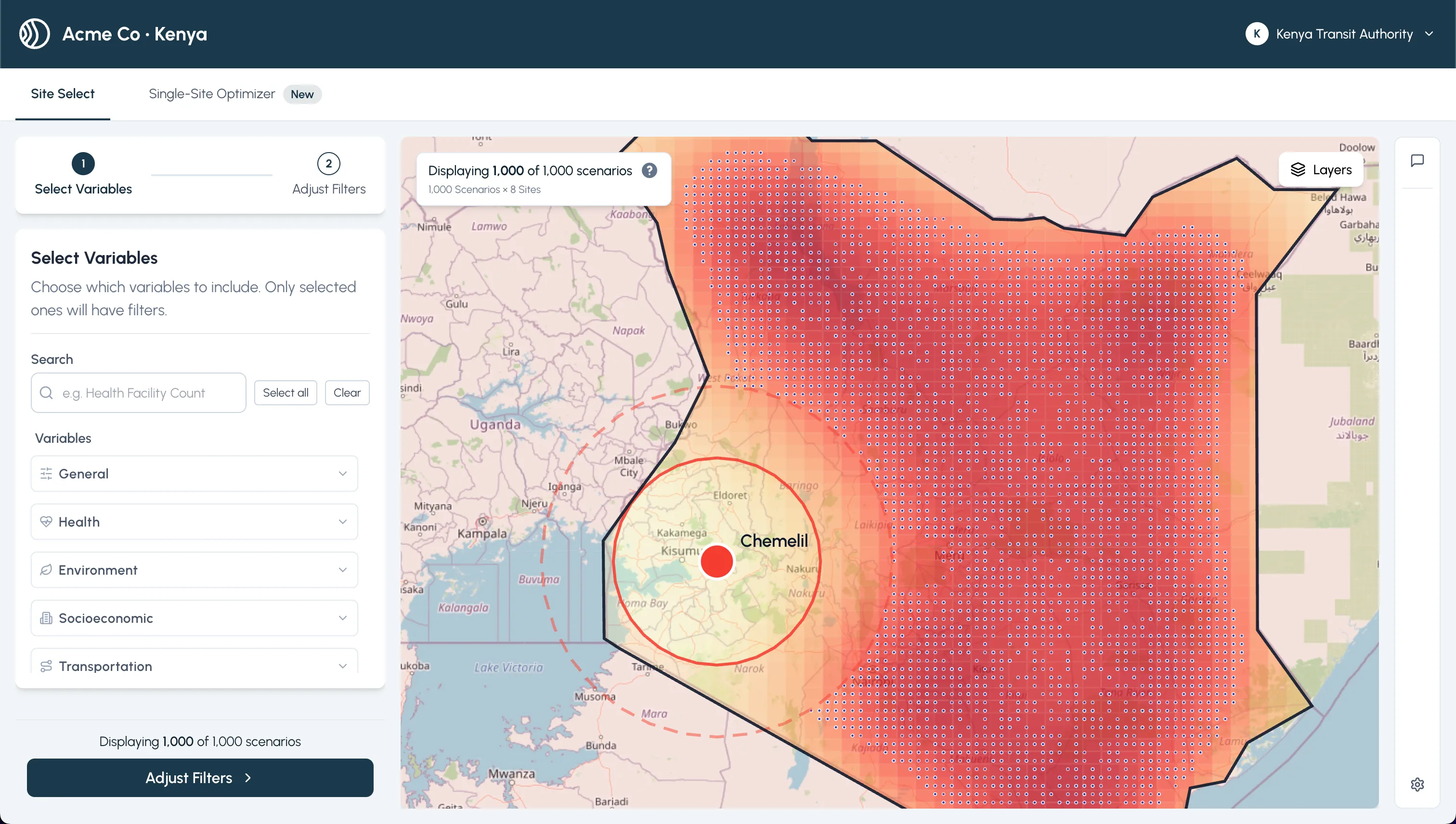 Landing in results with ranked sites and quick filters
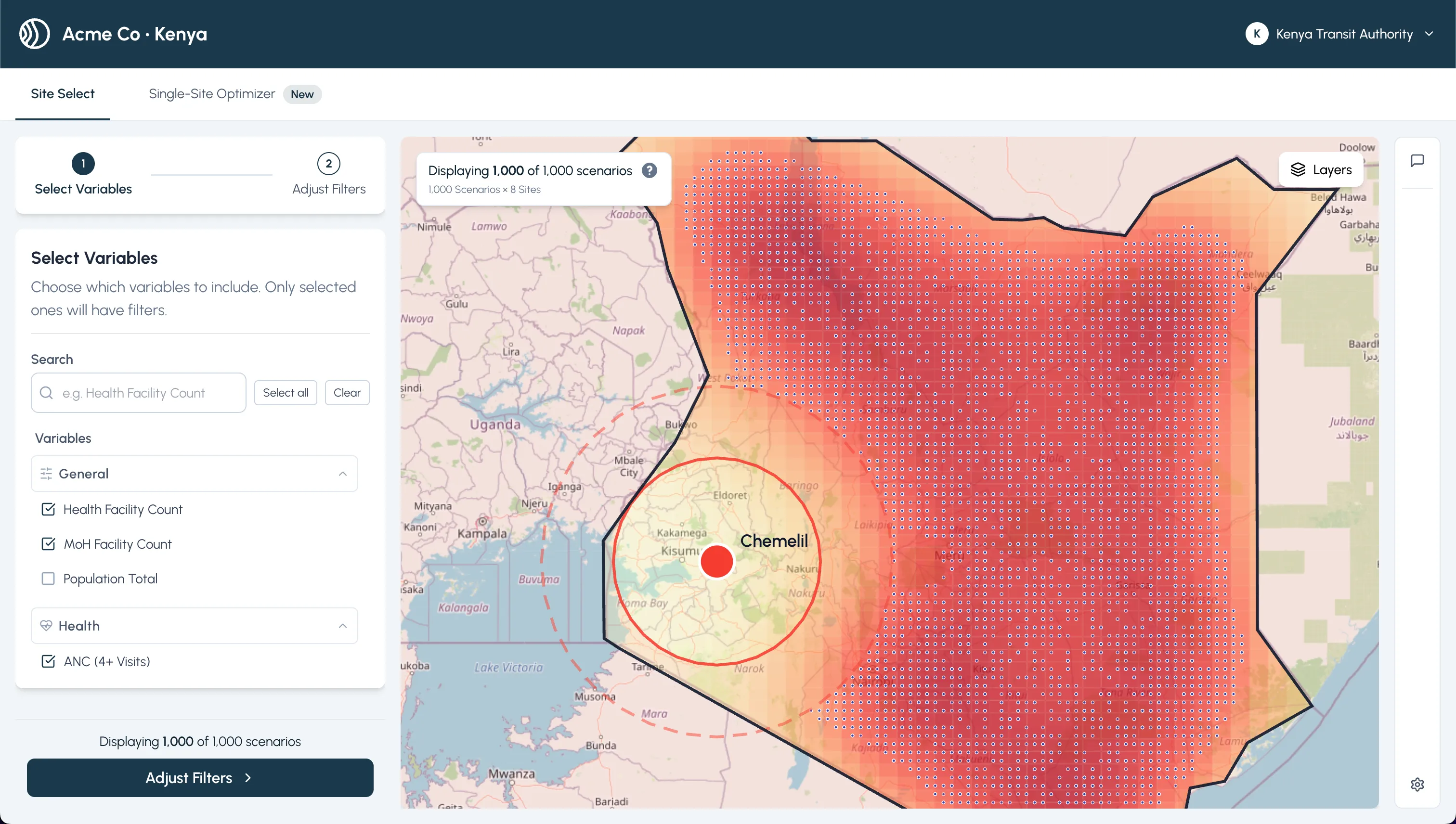 Filters + histogram tabs keep the data story visible
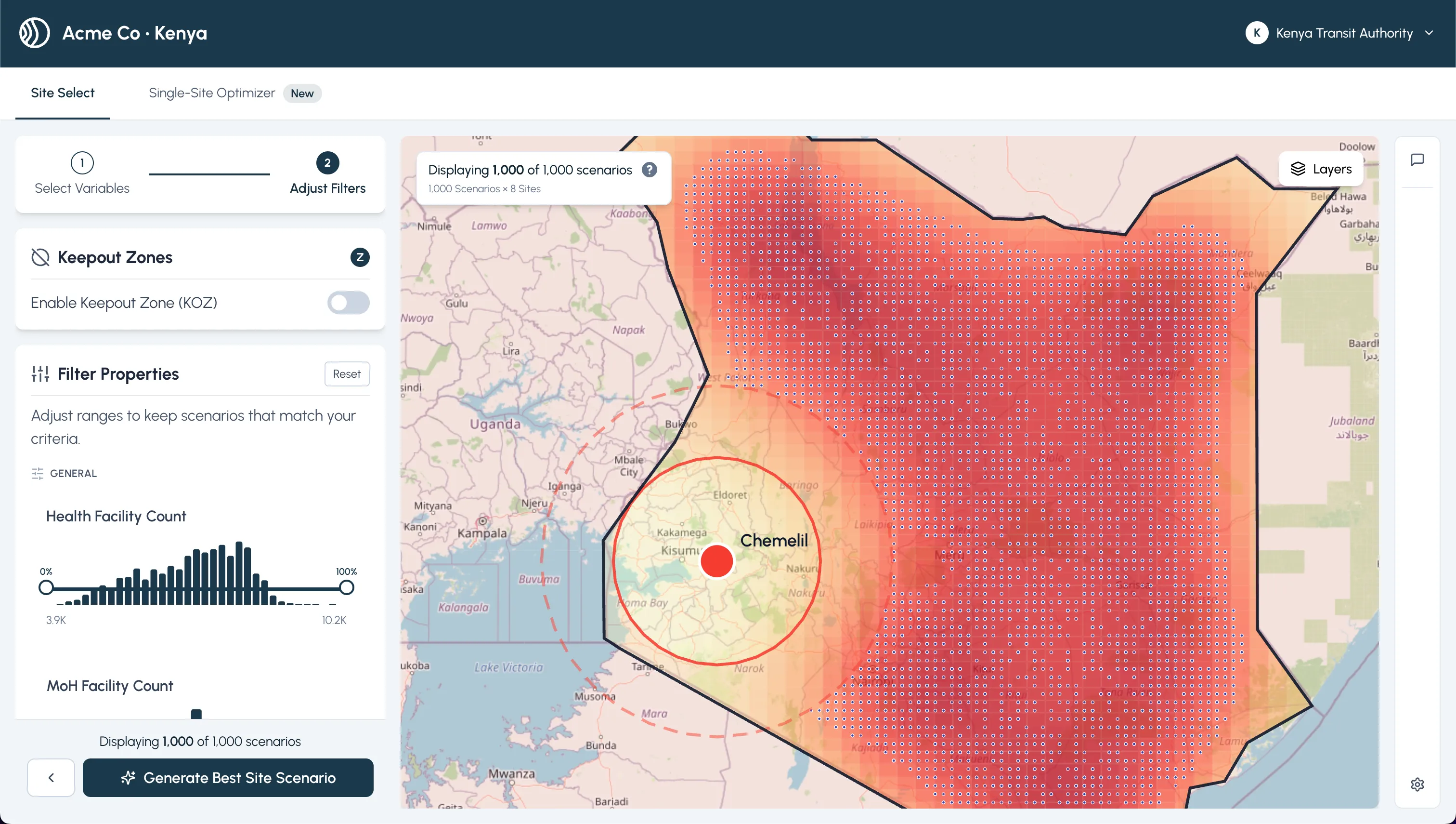 Detail drawer for a candidate with KOZ awareness
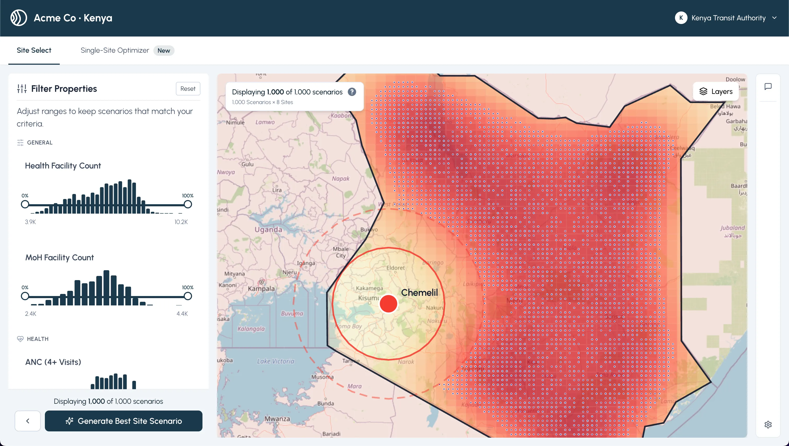 Map + reference layers to validate coverage and constraints
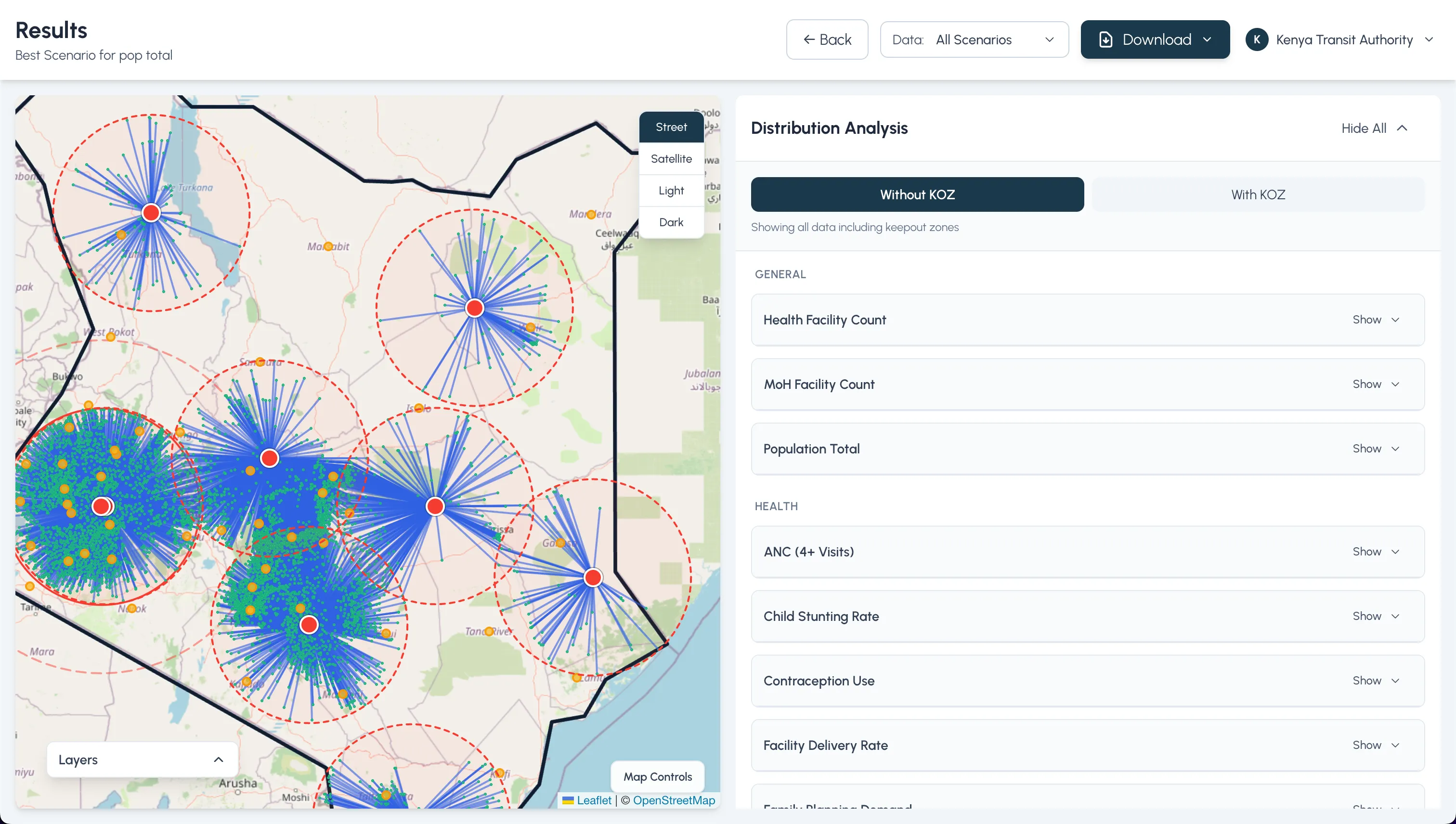 Shortlist view before routing and export
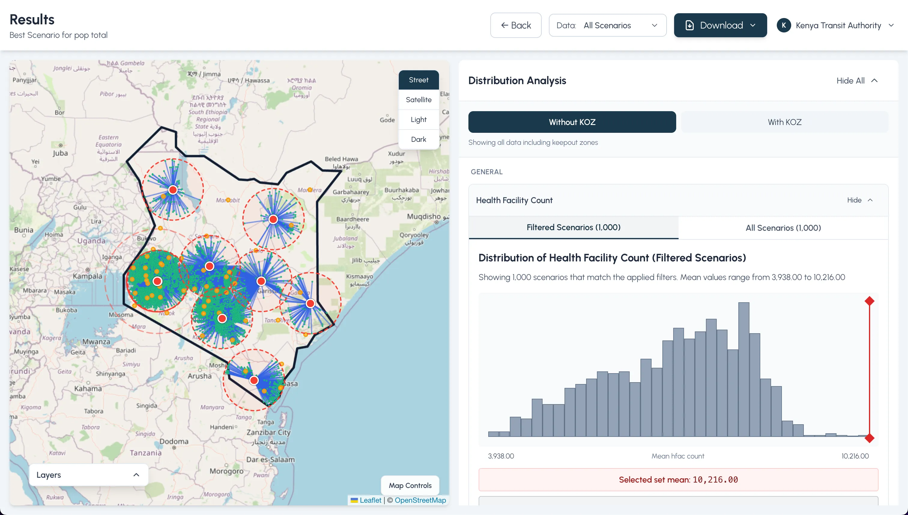 Recommended site, ready to ship with exports
Single Site Optimizer
For teams that want one definitive pick, I added an optimizer that gathers weighted criteria and explains the trade-offs behind its recommendation.
- Progressive disclosure keeps people focused on one decision at a time
- Live feedback shows how weight changes nudge the outcome
- Outputs narrate why a site won, not just which site
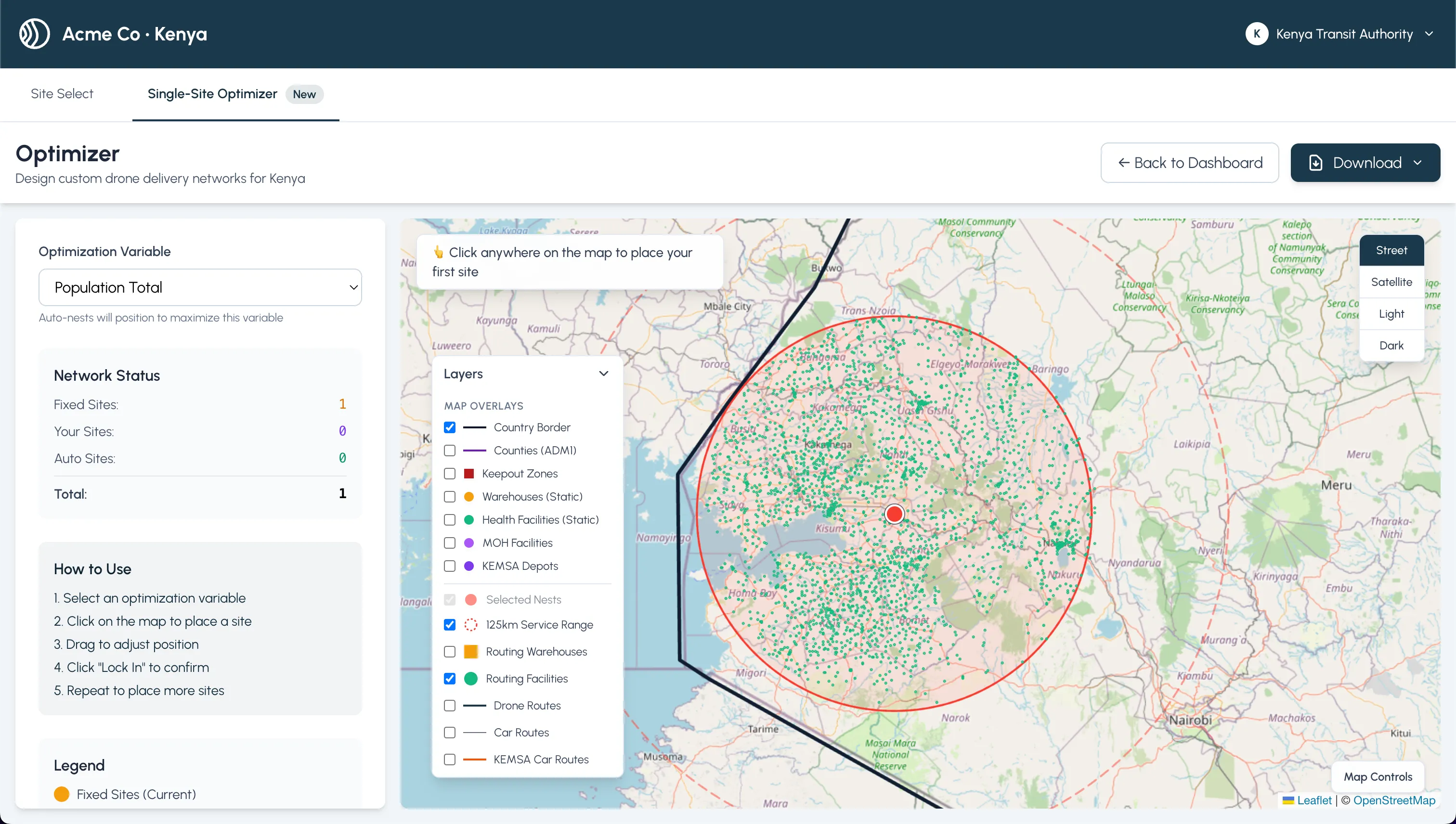 Collecting weighted criteria for a single-site recommendation
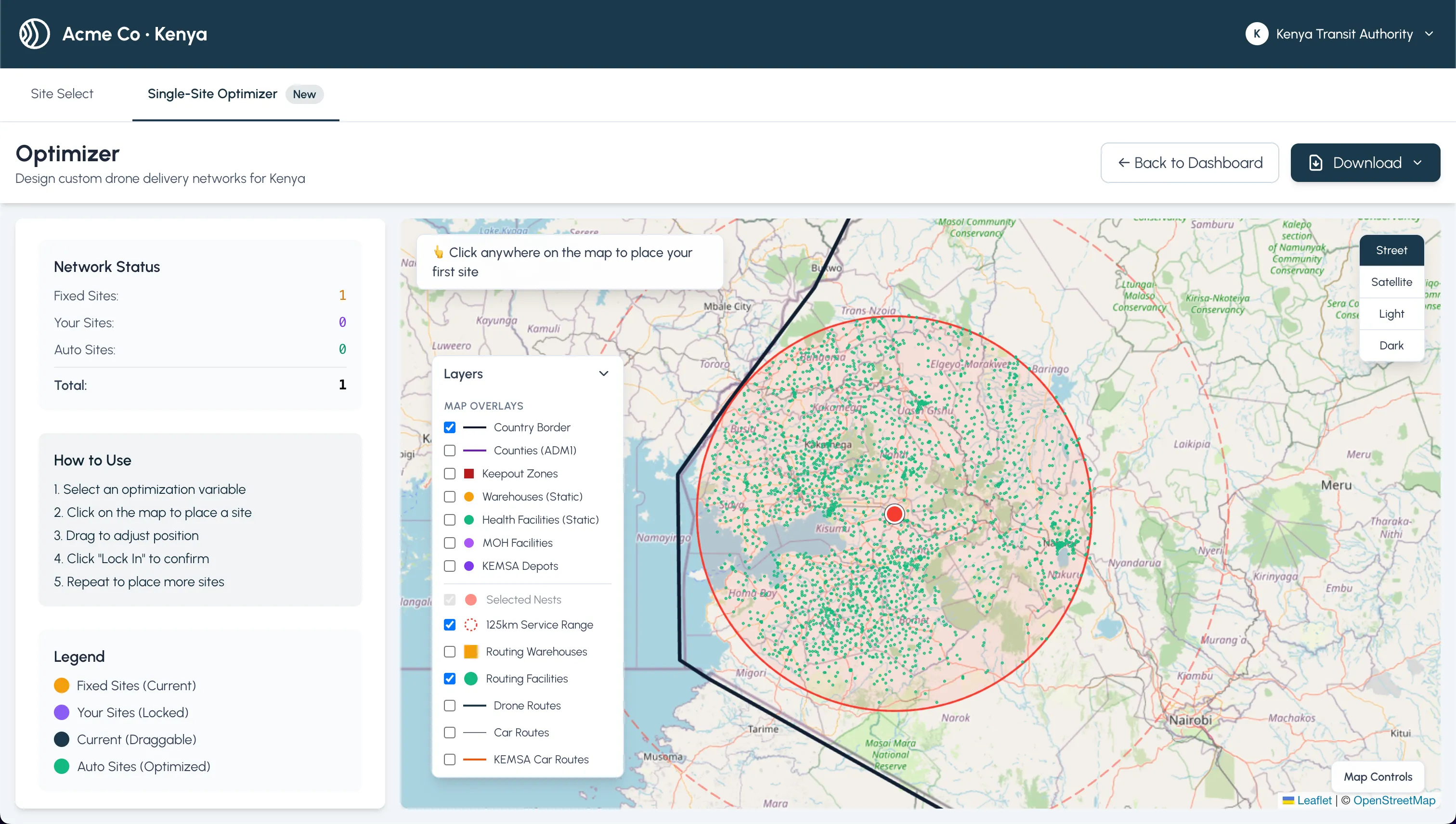 Progressive disclosure with live feedback on trade-offs
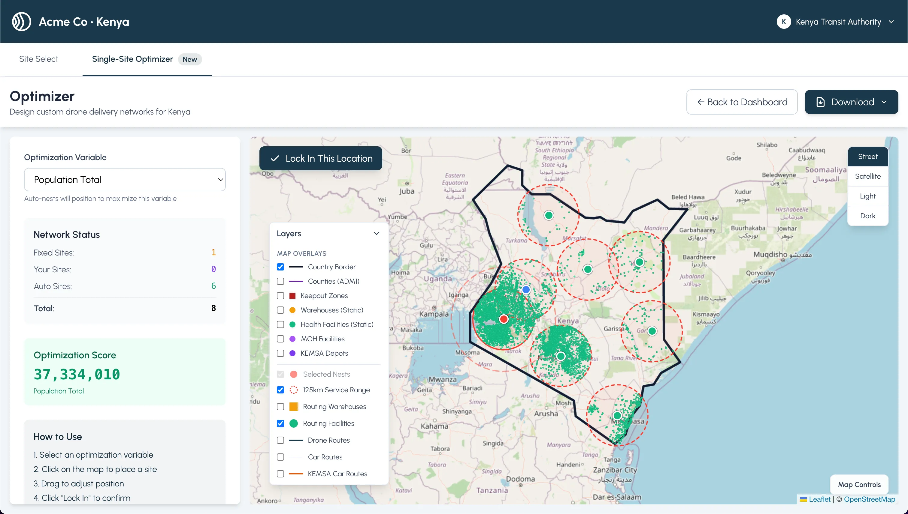 Optimizer output with final scoring and rationale
Outcomes
- Shows a complete decision loop: filter → spatially validate → compare routing → export
- Respects field workflows: fast toggles, KOZ-aware comparisons, and readable charts
- Produces shareable artifacts that explain why a scenario was chosen, not just which one
Last Updated: