/ 4 min read
TicketManager Design System
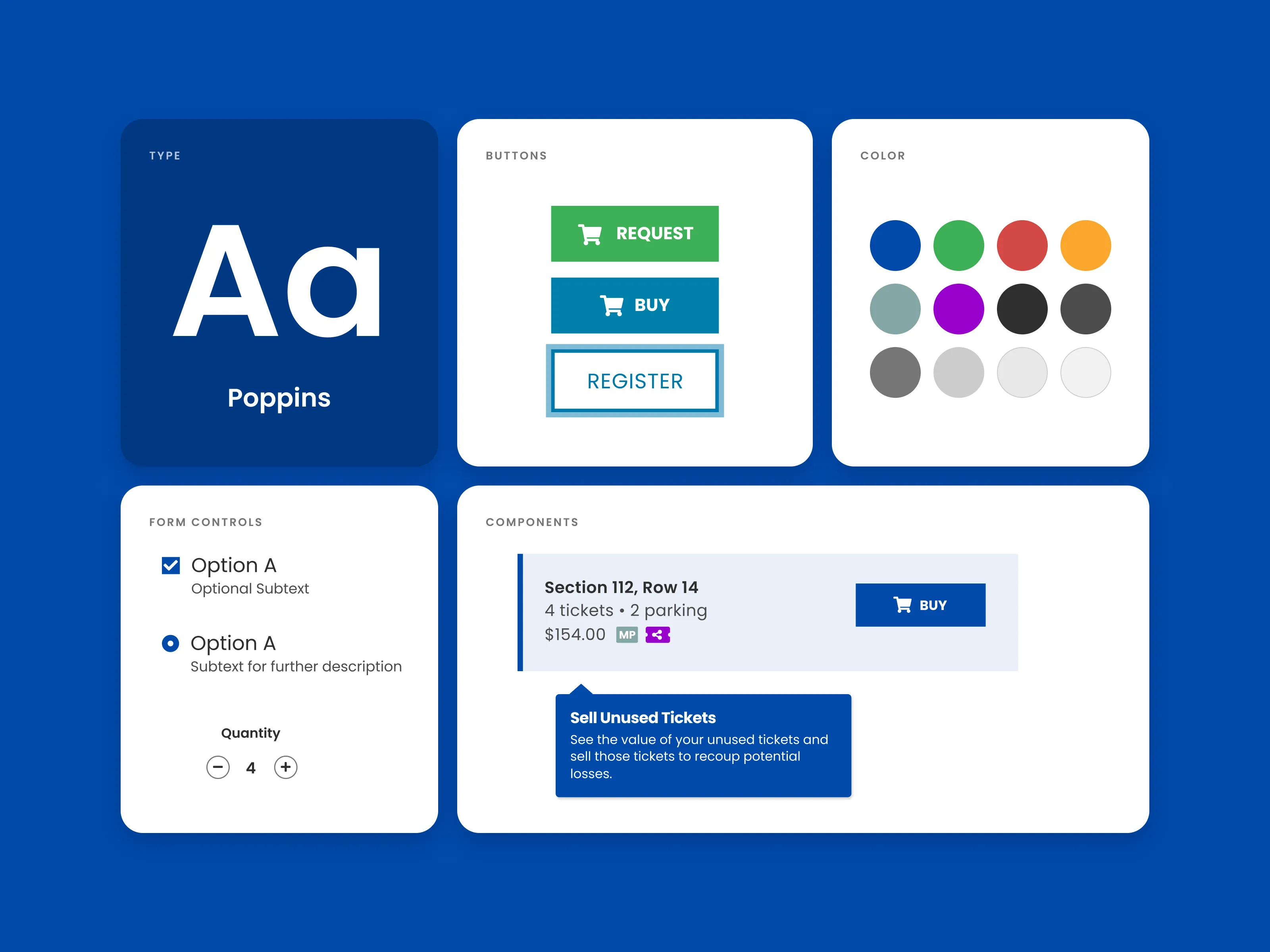
The first design system for a 10,000-user ticketing SaaS platform: shared color and type foundations, and components with every state defined.
Project overview
Role: Design Strategist & UI Designer
Timeline: 2016–2021, documentation completed in 2026
Tools: Sketch, later migrated to Figma
TicketManager is an entertainment SaaS platform that companies use to manage and distribute tickets to sporting events, concerts, and shows, used by 10,000 people across more than 100 corporate organizations.
For the platform’s Angular redesign, I built TicketManager’s first design system from the ground up: a modular component library, adopted across product teams, that standardized UI patterns and shortened the design-to-ship cycle.
The problem
TicketManager’s Chief Product Officer set out to replace the company’s legacy PHP platform with a full redesign built in Angular. A rebuild from the ground up needed more than new screens: it needed a modern design system and component library that both designers and engineers could work from.
Two goals shaped the system:
- Smoother design-to-development handoff: components defined once in a shared library, with every state specified, so engineers could build matching Angular components instead of interpreting one-off mockups
- A cohesive design language: one set of colors, type, and patterns across the new web platform, and later the iOS and Android apps, so the product felt like a single system rather than a collection of pages
Approach
- Foundations first: a small set of named color styles and a single typeface, Poppins, so every component draws from the same building blocks
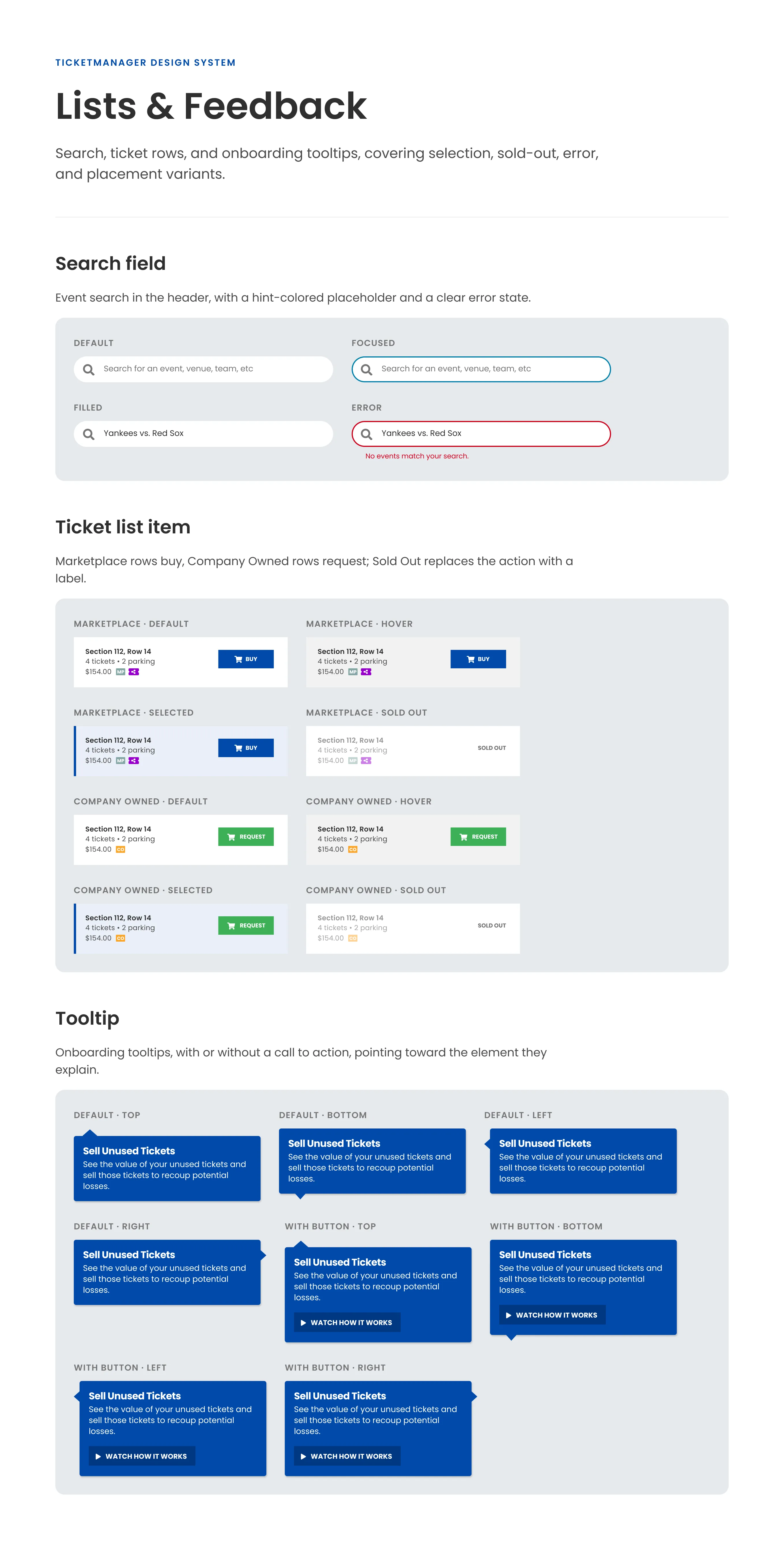
- Components built for real work: ticket rows, event cards, filters, and form controls modeled on how people find, request, and buy tickets
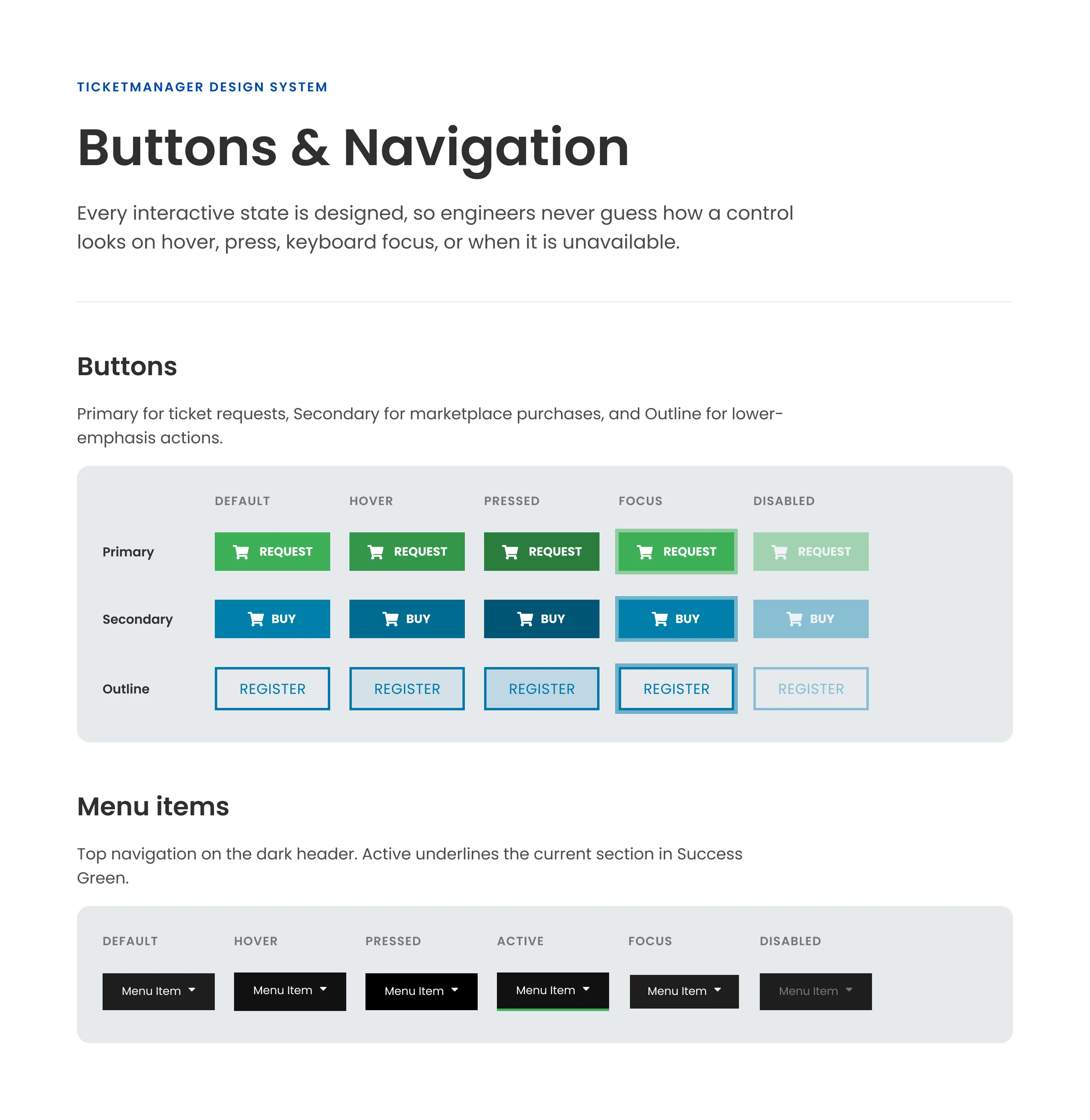
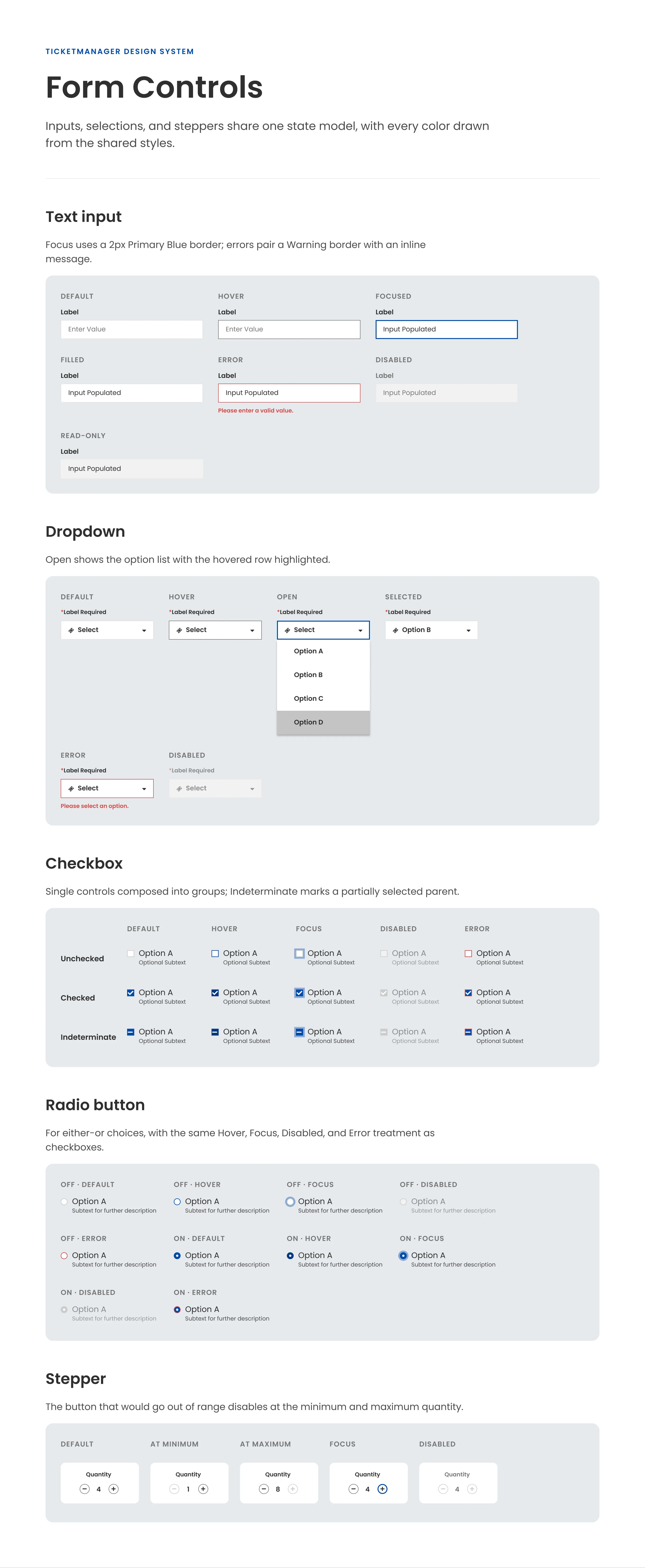
- Every state defined: hover, pressed, focus, disabled, and error states for each interactive component, so engineers never have to guess
- Platform-aware: shared styles everywhere, with native controls where people expect them, such as each platform’s own date picker on iOS and Android
Design system foundations
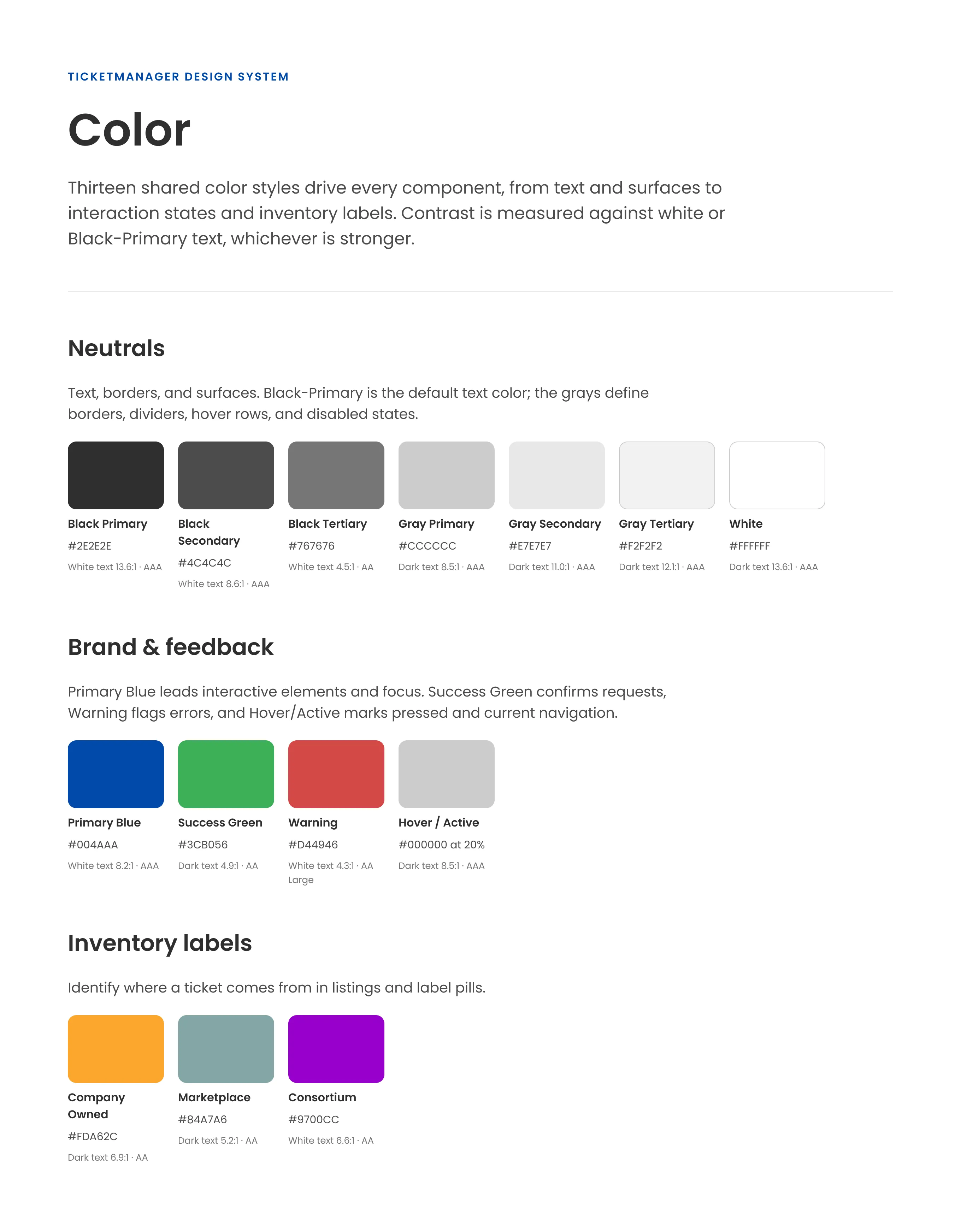
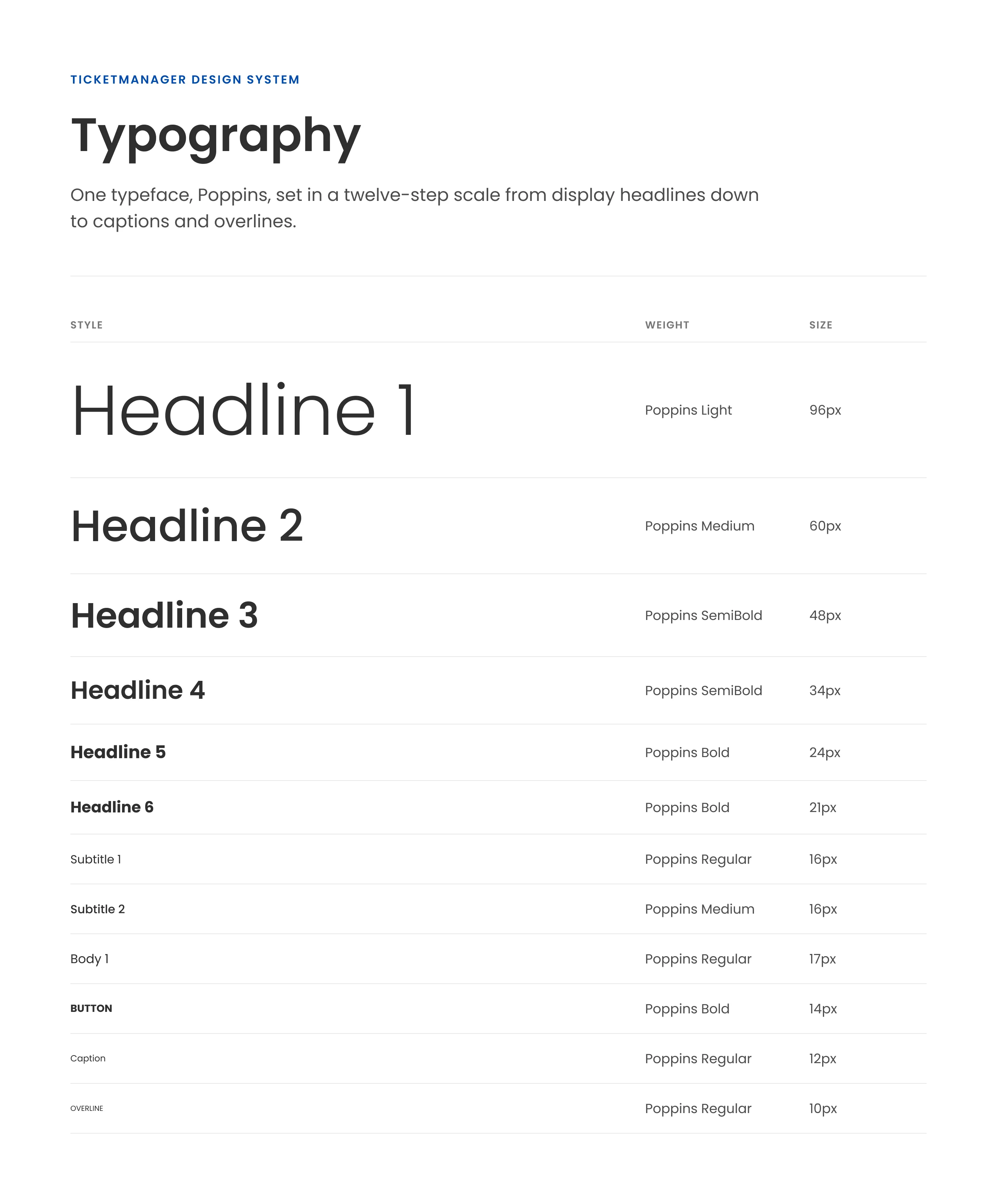
Thirteen shared color styles and a single typeface underpin every component. Each swatch lists its hex value and the contrast it achieves with white or dark text, so teams can pick accessible pairings without guesswork.
Component states
Core components define every interactive state, so engineers never have to guess how a control should look on hover, press, keyboard focus, or when it’s unavailable. Each state draws its color from the shared styles: Primary Blue for focus and selection, Warning for errors, and the gray scale for disabled and read-only states.
Applying the system
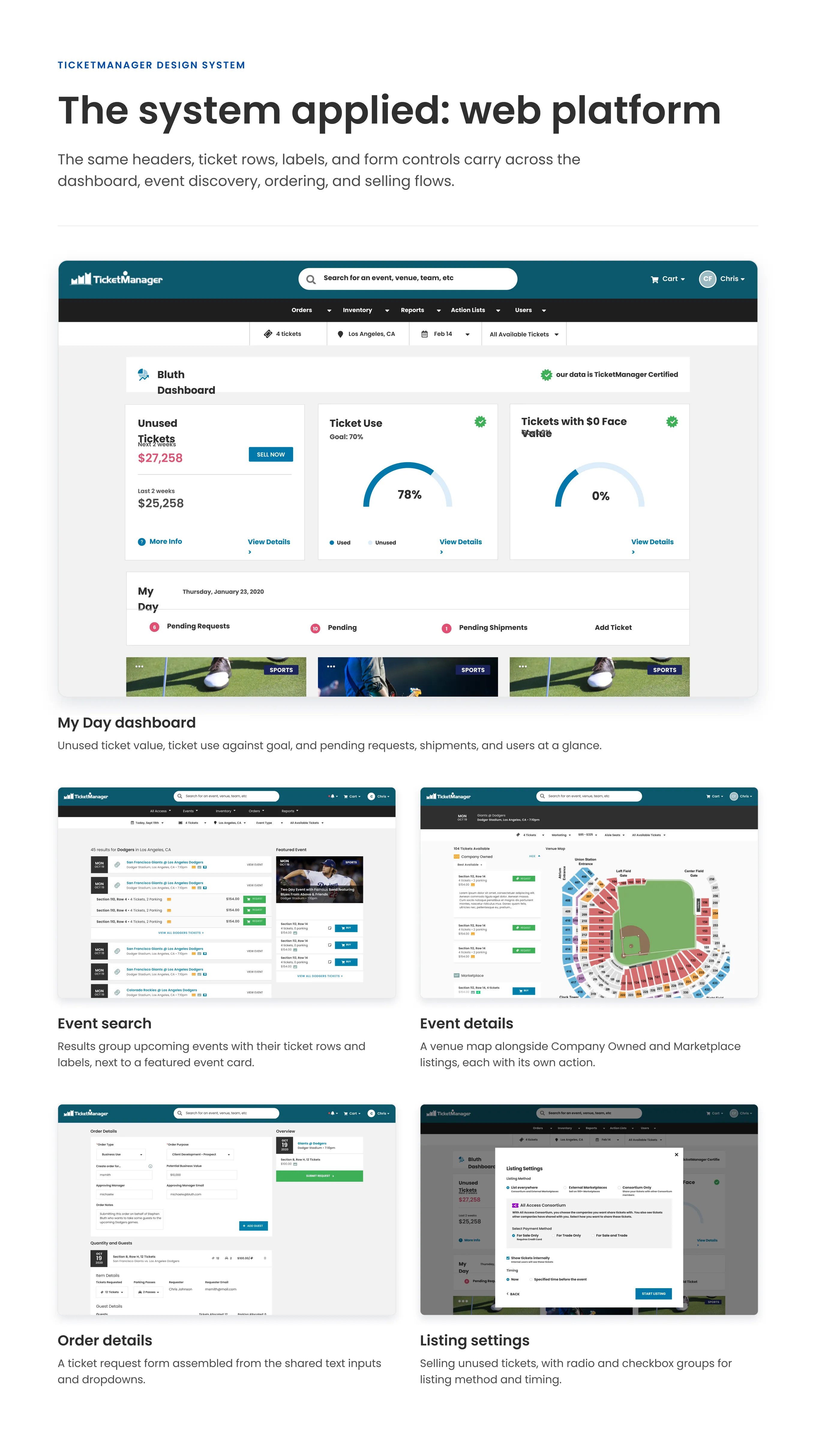
On the redesigned Angular web platform, the same headers, ticket rows, labels, and form controls carry across the dashboard, event discovery, ordering, and selling flows, so a pattern learned on one screen works the same way on the next.
The first major product built on the system was the iOS and Android redesign. Event search, filters for location, date, and ticket quantity, and a recent activity feed were assembled from shared components, so the apps stayed aligned with the web platform while still feeling native on each device.
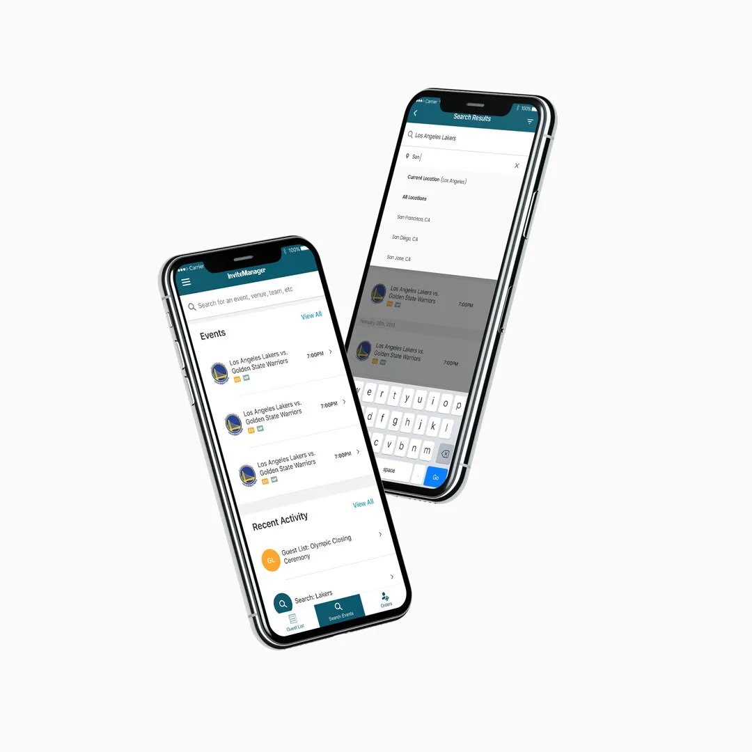 Mobile event search and listings built from the shared components
Outcome
- Adopted across product teams as the shared source of UI patterns
- Shortened the design-to-ship cycle by giving design and engineering the same components to work from
- Provided the foundation for the web platform and the iOS and Android redesign
In 2026 I revisited the migrated Figma library to complete the missing component states and document the foundations shown above.
Last Updated: